-
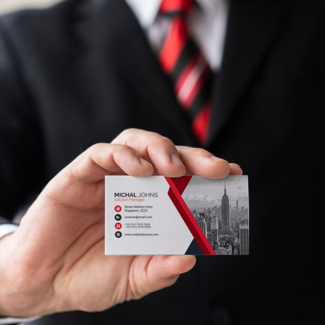
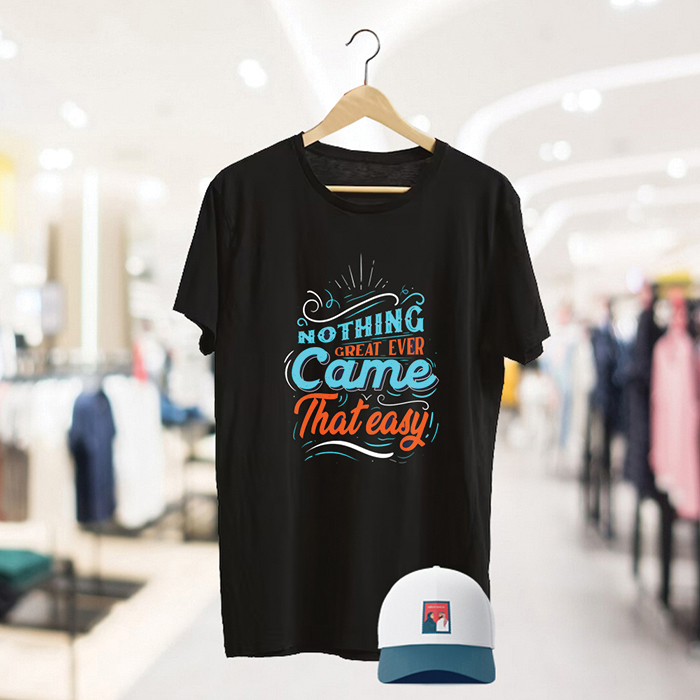
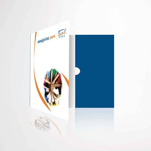
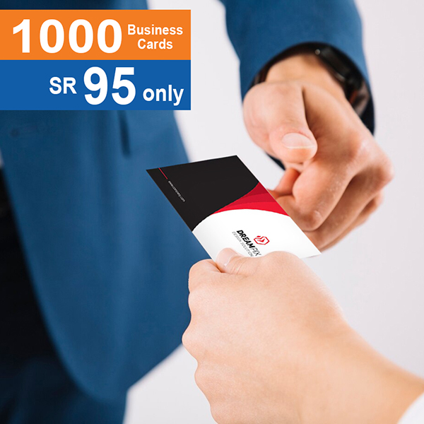
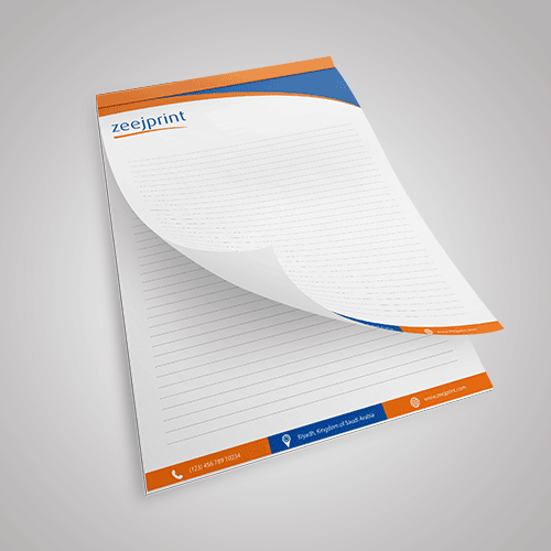
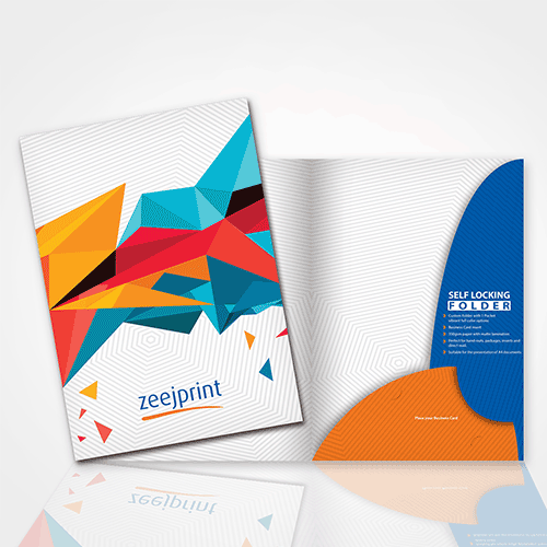
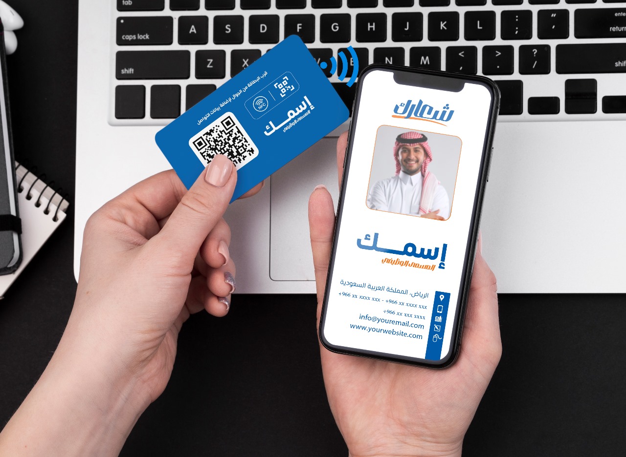
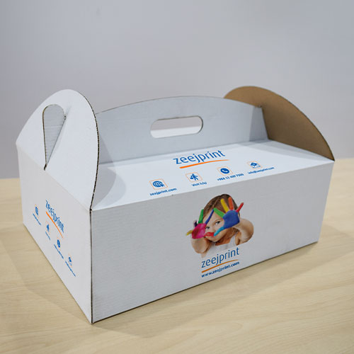
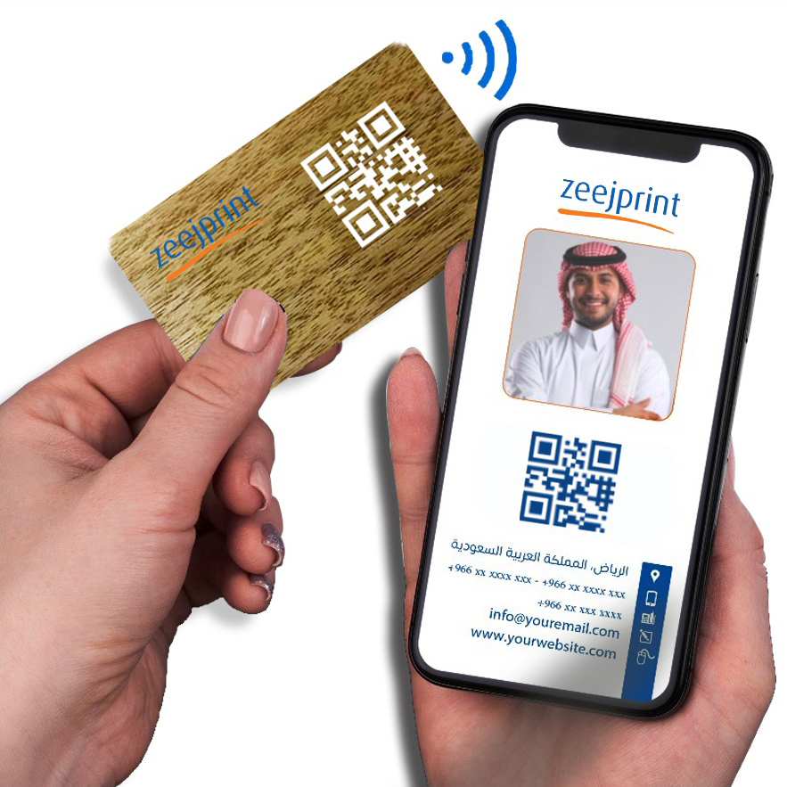
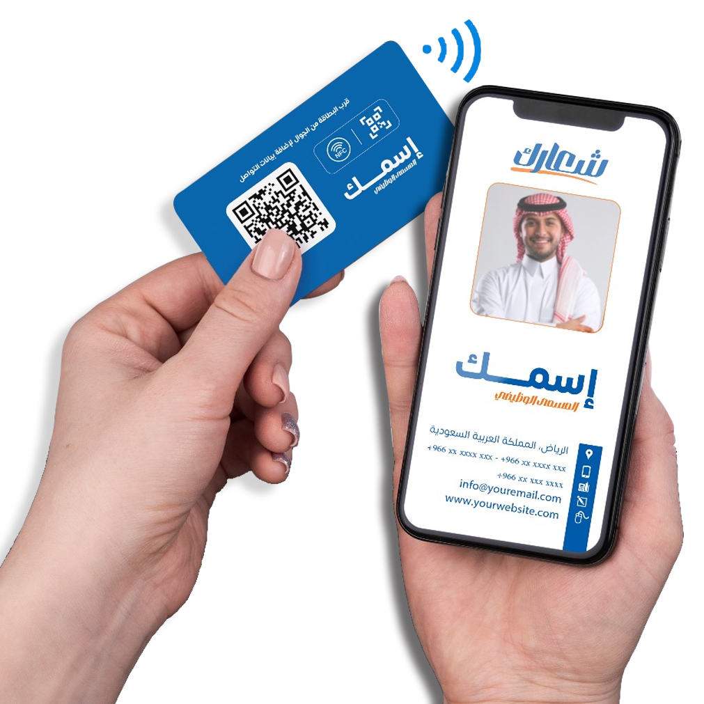
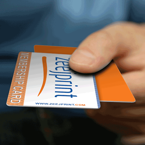
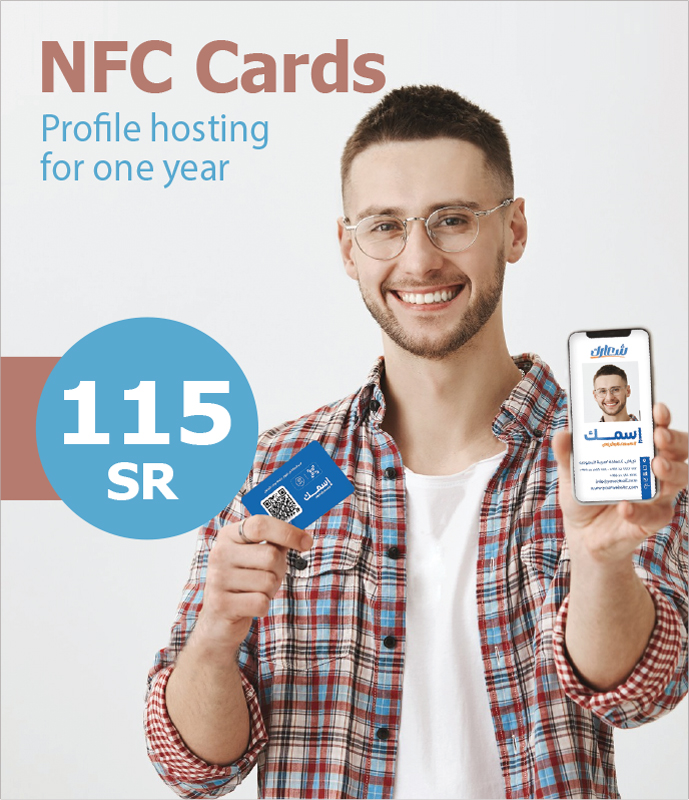
Business StationeryBusiness Cards Standard Cards Premium Cards Special Finishes NFC Cards Special offers Smooth finish Textured finish Specialty textured Holders & MoreLetterheads Standard letterhead Textured Finish LH Smooth Finish LH Specialty Textured LH Special offers LH ♻️Recycled LH NFC Business Cards Folders Standard Premium Special offers.
-
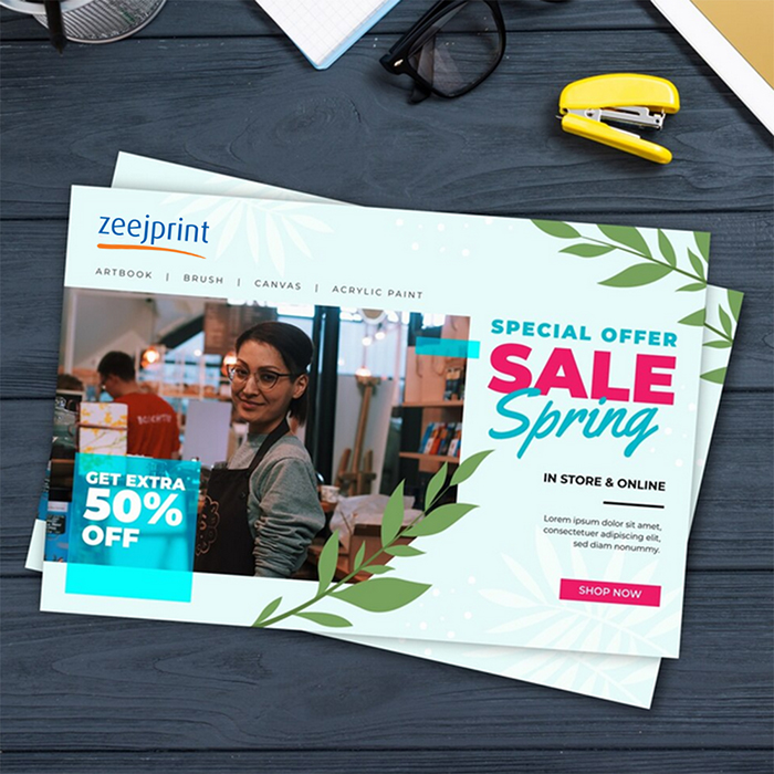
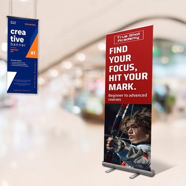
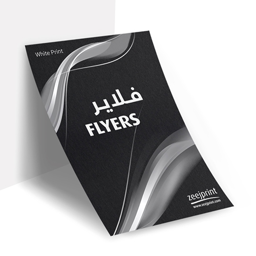
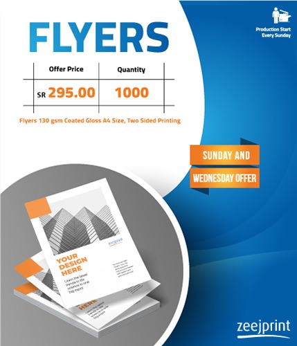
Marketing MaterialsFlyers Standard- Smooth finish- Special Finishes- Textured finish- Specialty textured- Special offers- ♻️Recycled. Brochures Standard Premium Stickers/Labels Vinyl Labels Paper Lables Roll Lables
- See All Products


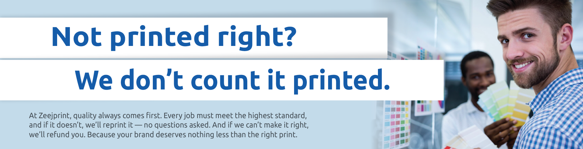


It's Simpler than You Think!
Curious About the Ease of Ordering with Us?
Select the product


Upload your design


Pay Online

Collect / Receive
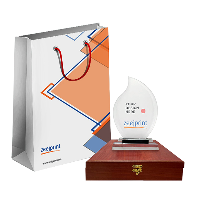
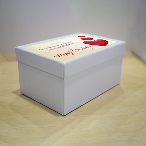
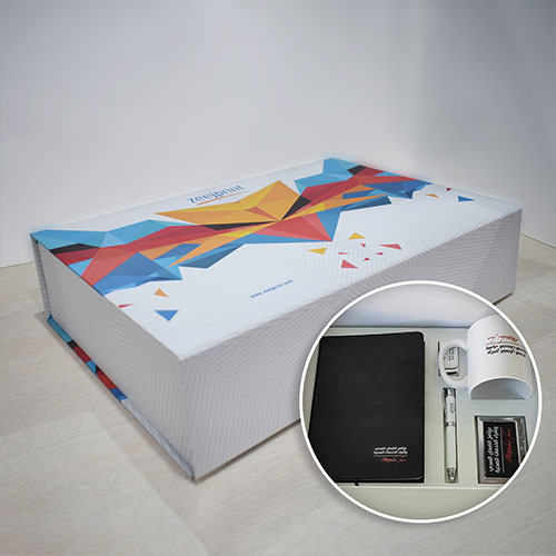
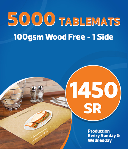
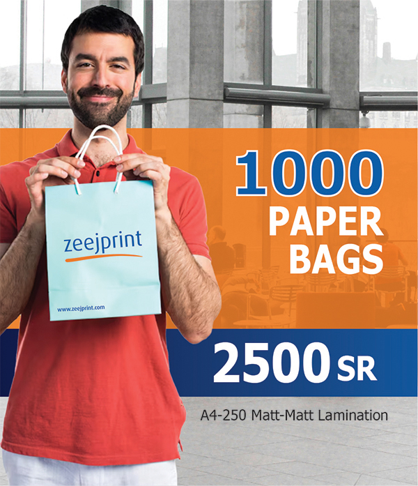
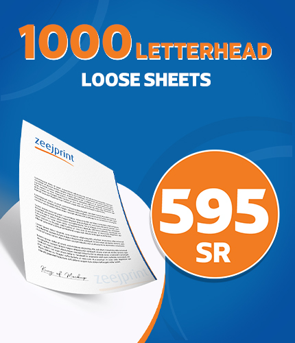
Big Savings, Bigger Value
Your Pocket-Friendly Products Await here
We let ourclients successbe our speaker

Bijo Alex
We appreciate the professionalism of zeejprint and specially staffs.
Very impressive responses from designers, great end result and nice support. Will definitely continue to use

Rabih
Thank you for the great service you have been giving throughout the past year and I am sure we are still going to rely on Zeej as one of the best printing suppliers for the upcoming years.

Eyad Alshabaan
One of the best, most comfortable and fastest printing presses in the areas of #Khobar, #Dhahran and #Dammam. Professional work, high customer confidence, and very reasonable prices.

Redzki Red
Print high quality and premium business cards without hassle when u order online only from @zeejprint Thanks to its combination of excellent print quality, good design tools, reasonable prices and timely delivery turnaround. The company also prints promotional products like mugs, posters, and even bags; etc. SHOP TODAY !

Bader Al.Zerri
Good service and best company
Source: Google Review

Abdulrahman Alyahya
Best place to print The staff here are very helpful
Source : Google Review

JAMAL MOHAMED
Zeej print is good for printing and customer care
Source : Google Review

Christine L. Phillips
My shirts look wonderful, and they were packaged so nicely. My order was perfect, and our participants were so pleased with how they turned out. Your help was so appreciated. It was such a pleasure doing business with you and your company!

Faisal Alruwaili
If the print has a gate, it is Zeej.
Source: Google Review

wd diamond west
Honestly, Ethics and etiquette in dealing and punctually. Best service. Great experience, good behavior, classy style, credibility.
Source: Google Review
Frequently asked questions
Welcome to our FAQ section! Here, we’ve answered some of the most common questions we receive. If you can’t find what you’re looking for, feel free to reach out to our customer support team.
You can place an order by selecting the product you want and
uploading your artwork. If you need any assistance, please contact our support
team. Please note that we do not currently offer an online design tool.
We accept high-resolution PDF files only. Please make sure
your files are in CMYK color mode and have a minimum resolution of 300 DPI for
the best printing quality.
Yes, we offer professional design services for a fee. Please
contact our support team to discuss your design needs and get a quote.
We provide digital proofs upon request. Please contact our support team to arrange for proofing services.
You can track your order through your personal account on our website once it has been shipped.
We offer standard shipping and RedBox delivery options. Shipping fees and delivery times depend on your location and order size.
Please contact our support team as soon as possible to check if your order can be modified or canceled before production begins.
Please contact us within 24 hours of receiving your order and provide photos of the issue. Most orders arrive without damage, but we will assist you if there is a problem.
We accept credit cards and STC Pay for payments.
Absolutely. We handle all customer files with strict confidentiality and never share your designs with third parties.
Please upload files with a minimum resolution of 300 DPI, in CMYK color mode, and include bleed areas if applicable.
Yes, we offer custom sizes and a variety of specialty papers and finishes. Please contact us to discuss your specific needs.
Make sure your files are in PDF format, with the correct dimensions, include bleed and crop marks, and use high-resolution images and embedded fonts.
Yes, you can easily reorder as long as your original files are saved in our system.
Customer satisfaction is very important to us. Please contact us immediately with details and photos of the issue, and we will work to resolve it promptly.